My Role
UX Lead: product strategy,
research & wireframing
Industry
Finances
Product type
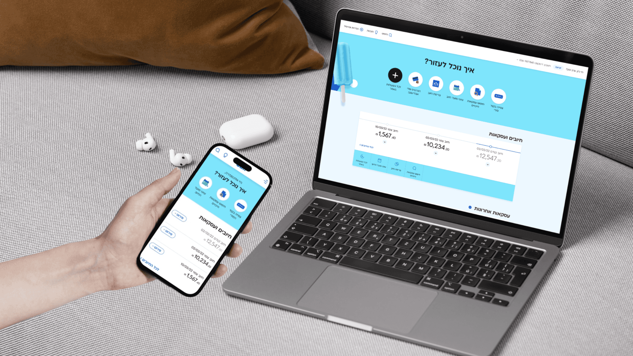
Responsive Design, Web
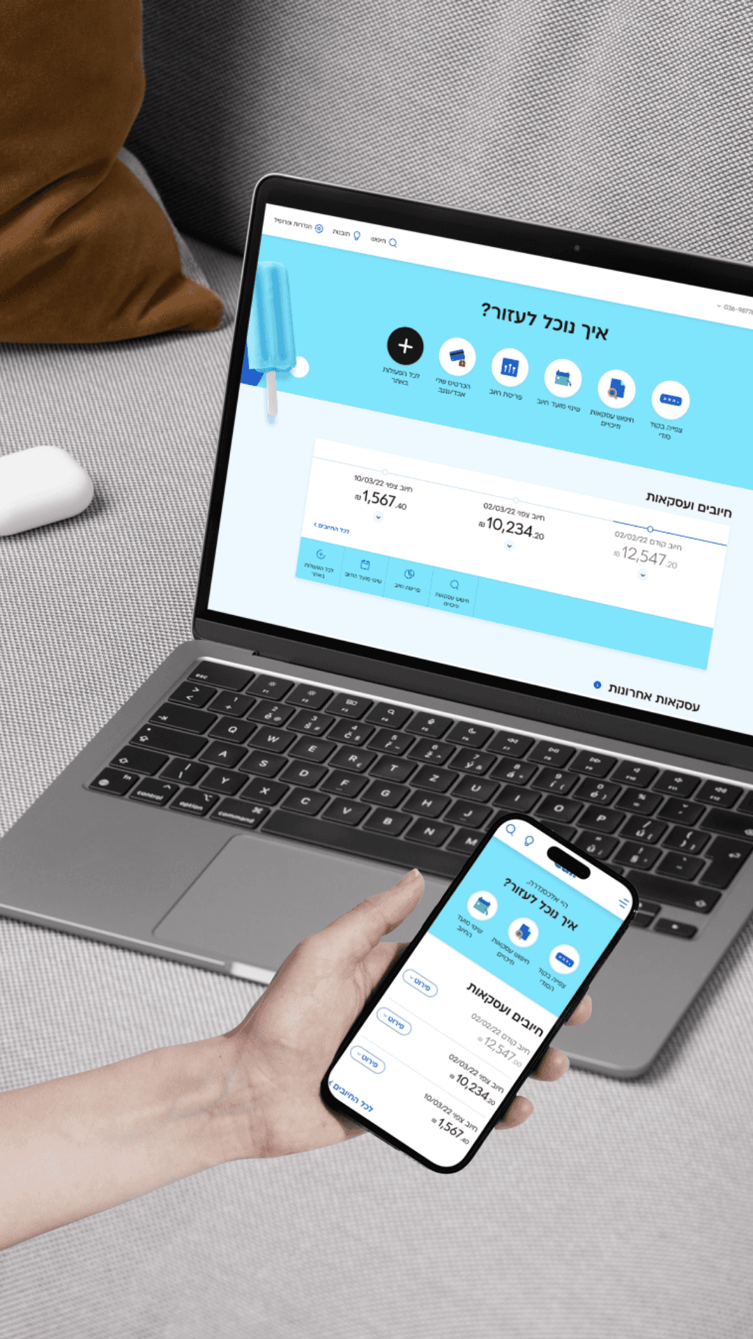
Cal's website was two separate products pretending to be one: a desktop version and a mobile version, inconsistent and increasingly outdated. For a fintech product handling real users' money, that inconsistency was a trust problem, not just a design one.
The business decision was to rebuild from scratch: one fully responsive site, a new personal area, and a single experience across all devices. I led the strategy, research, and wireframing, working with a visual designer on UI execution.


Challenge #1
Desktop UX maturity
The organization (and I) had years of expertise designing for mobile, but far less for desktop.
Solution #1
Learn, research, iterate
I just love to expand my knowledge. Learning is my kingdom. I learned everything I could about desktop design: from concepts and trends to inspirations. Later during the research phase, I put more effort in the desktop designs. Unfortunately, I can’t post these specific research processes.
What I learned from the desktop design: users had to migrate from the old website to the new one. They have usage patterns and information architecture they know. Deviating from the known might cause over-complexity and has to be carefully planned and tested. Sometimes, familiarity and simplicity are more important than cutting-edge modern UX.

Challenge #2
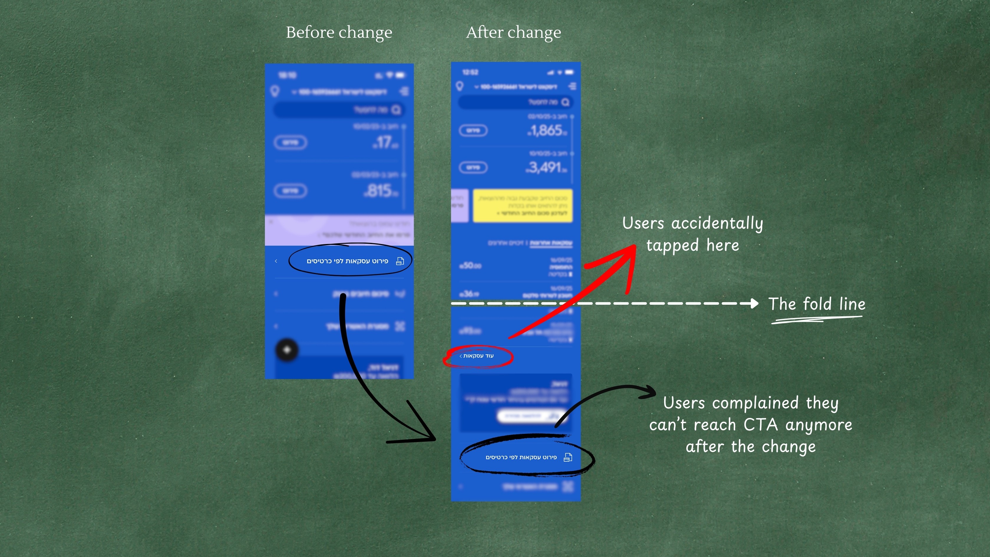
Balancing Bootstrap responsiveness with usability
To develop quickly, I was asked to stick to bootstrap guidelines. To do this, I had to learn many things: what is bootstrap, what are breaking points, what is “impossible” and what are just lazy developers?. At some point I realized that some components were just too complex for bootstrap regular guidelines.
Solution #2
Deviating from bootstrap through hierarchy of importance
It was a true challenge to design everything to be exactly like the natural breaking between mobile and desktop. For the most parts, I found designs that perfectly match mobile and desktop in a responsive way. When research showed I have to, I insisted on a special treatment for a component beyond the regular breaking point, to ensure usability.
Challenge #3
Stakeholder alignment
With so many stakeholders, priorities often conflicted. UX is not only about pixels but about seeing the big picture, communicating with various stakeholders. Business units wanted their features prioritized, tech had major constraints, and the user had to get seamless experience.
Solution #3
Step by step prioritization
I had to bridge product, development and business stakeholders to refine what could realistically be launched on the first MVP, while taking in account everything that could impact it. Together, we mapped all possible user actions (e.g., block card, take a loan, view transactions) and prioritized them considering both user value and technical feasibility.
This turned a potential chaotic mess into a controlled process that everyone agreed on, and helped me to make the best ux for our users. This is where I understood that UX is a bridge between different departments and roles in the project.
Results & Impacts
User and business satisfaction
points in 2 years
Shortened the web feature development time by more than
Responsive design became a foundation for future digital products
Reflection
Large projects lead to large professional growth
Handling design at scale has helped me to grow as a designer. Success is not only design, but alignment with
Structure, order and patience are key components. They helped to make sure that design, development and
business goals are aligned
This project was challenging not because of one complex screen, but because of its scope. I learned to balance speed with quality, bridge old and new systems and keep various departments aligned around the same goals. Good UX is not only about the interface, but also about creating clarity for teams and users during big changes.