My Role
UX Design, UX Lead, UX Research
Industry
Finances
Product type
Native mobile app


Design Methodology
Keep the hierarchy, the rest will follow
The most important part is how much I own the credit card company, and a UX principle that was followed is progressive disclosure: first show then explain. The top of the hierarchy was the sum of future payments, then the sum of each of the following debt payments. The order of the months was from present to future, because the closest payment is what matters.
Challenge #1
Multiple cards and billing dates
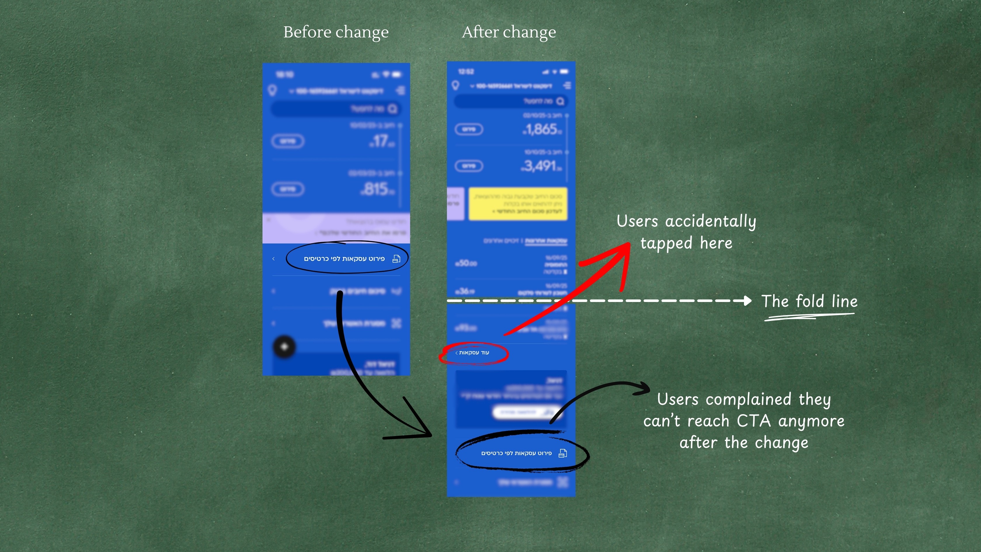
Totals might be confusing across cards and billing dates, so the design had to take it in account. The users were roughly divided to two groups: single vs. multiple card holders, each group makes about half of the users. Each group had the same need: to see total payments-by-months. In case of multiple cards making up the payment, the split by card had to be shown. The goal was to do as little as possible segment-tailoring and still provide high value.
Solution #1
Drill-down on demand
To reduce the cognitive load, I designed a progressive disclosure system:
Challenge #2
Uncertainty in flexible plans
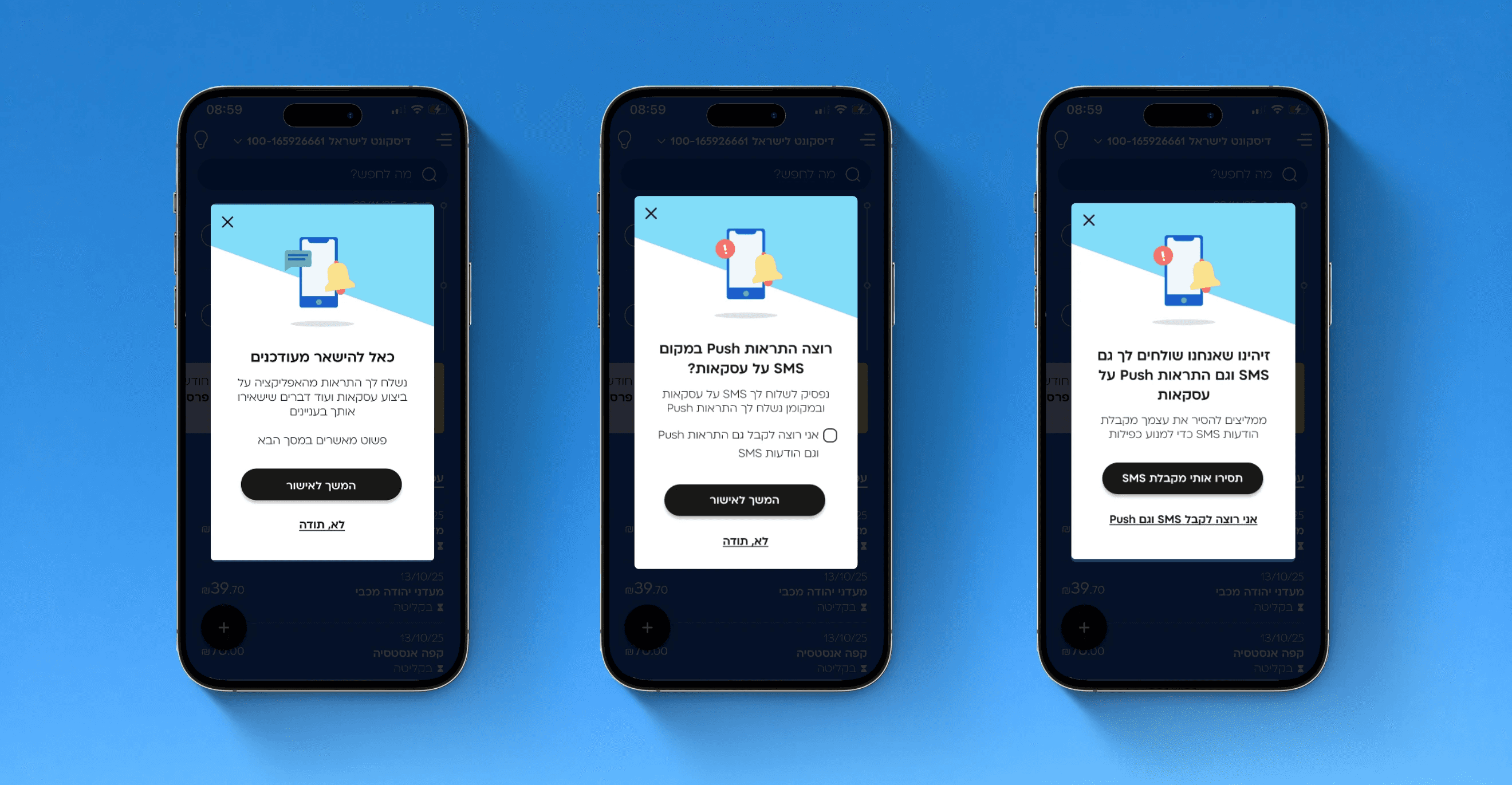
Future totals aren’t always final, for various reasons, for example flexible credit plans and transactions in progress. This risked breaking trust if numbers felt “wrong”.
Solution #2
Smart clarifications
Instead of hiding the complexity, I surfaced contextual explanations near the totals. This increased transparency and trust.
It was personalized, so users saw only the message(s) that were relevant to them. Following are examples of some of the scenarios. This approach helped to make the users trust the numbers.


To make it even more amazing
Enabling to see the transactions themselves
When the user taps the total payment for the card - they will be redirected to the transactions list module, that shows the transactions that the sum that was pressed is made of - a screen that I also took a part in designing. There, the user can see the various transactions making each card’s billing date, and drill down to see the full details of each transaction - another screen that I designed.
Results & Impacts
Simplifying financial complexity, not hiding it
I’m enthusiastic about taking a complex system, decompose it and building it block by block. This module balanced clarity and accuracy, provided transparency and disclosure about financial data
After half a year, the phone calls regarding future transactions were reduced by
This feature became one of the top-used in Cal’s app
Users reported higher confidence in planning expenses
Reflection
Financial UX is complex and beautiful
Balancing clarity with accuracy is the biggest challenge in financial UX
Progressive disclosure helps turn overwhelming data into manageable flows
Transparency builds trust - even if the data isn’t always perfect