My Role
UX Research
Tool
Usability Test
Research type
Qualitative Research, Moderated Research
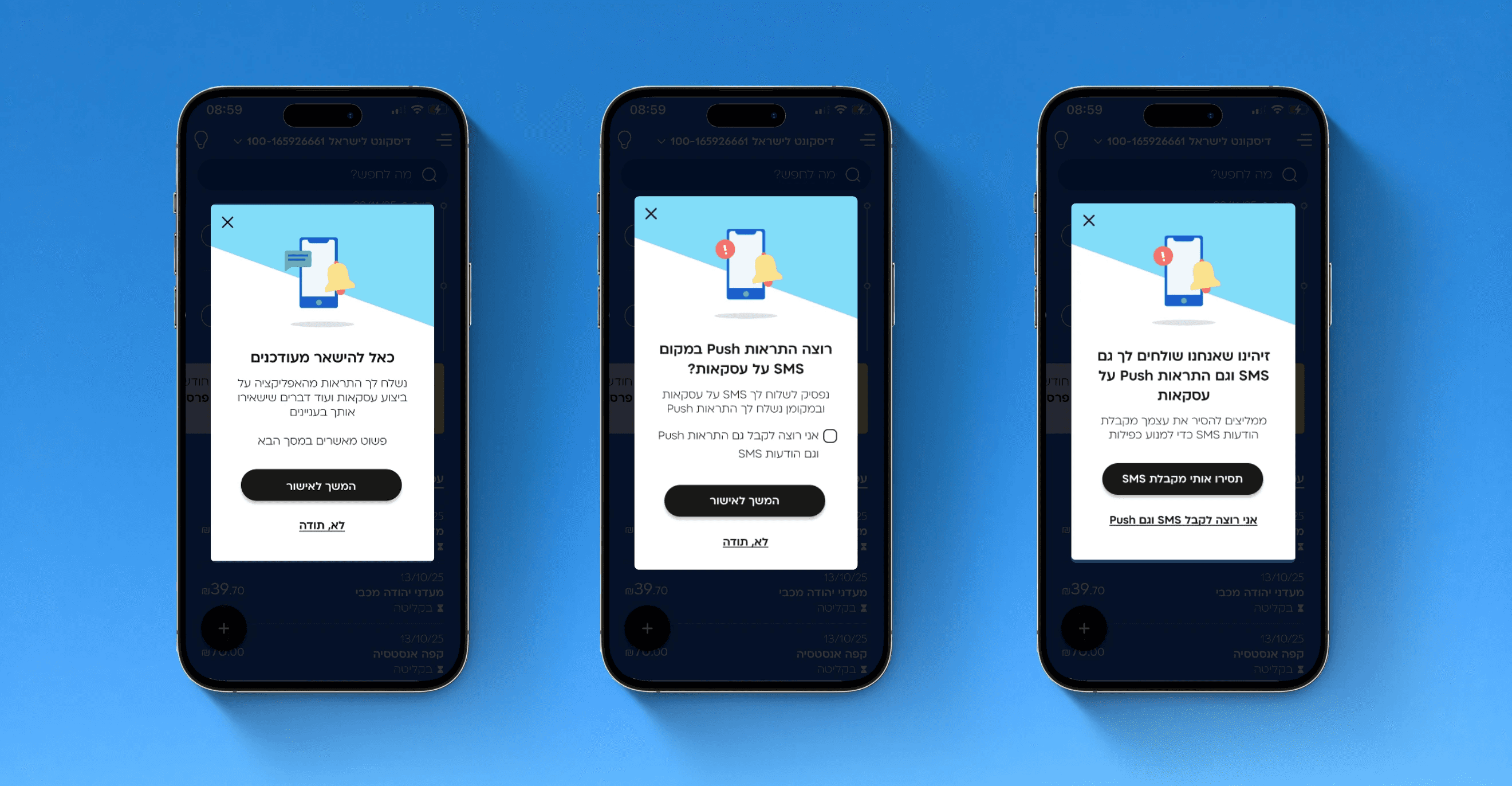
A small feature with a big usability problem
Moovit introduced an “Add to favorites” button to help users save frequent trips. But usability tests revealed that most users couldn’t find it or didn’t understand it.


10 users usability test
(task-based)


Context & research questions
Frustration from Moovit app’s UX
I chose the “Add to favorites” feature because it often frustrated me as a user. I wanted to test its predictability and discoverability. I ran a usability test with 10 Moovit users who rely on public transport daily.
Research questions
Is the “add” button discoverable?
Can users predict the functionality behind this button?
Method
Moderated usability test
I ran a usability test with 10 users, which consistedpre task questions, a core task, and follow-up questions.
Tasks focused on saving a destination for future use. When giving the participants the task, I didn’t use the words “add to favorites”, and thats for two reasons. First, users come with need. They don’t want to add to favorites’, they want to have quick access for their top destinations. Second, mentioning the button’s name can cause priming, which we would like to avoid.
Findings
Discoverability, predictability and placement

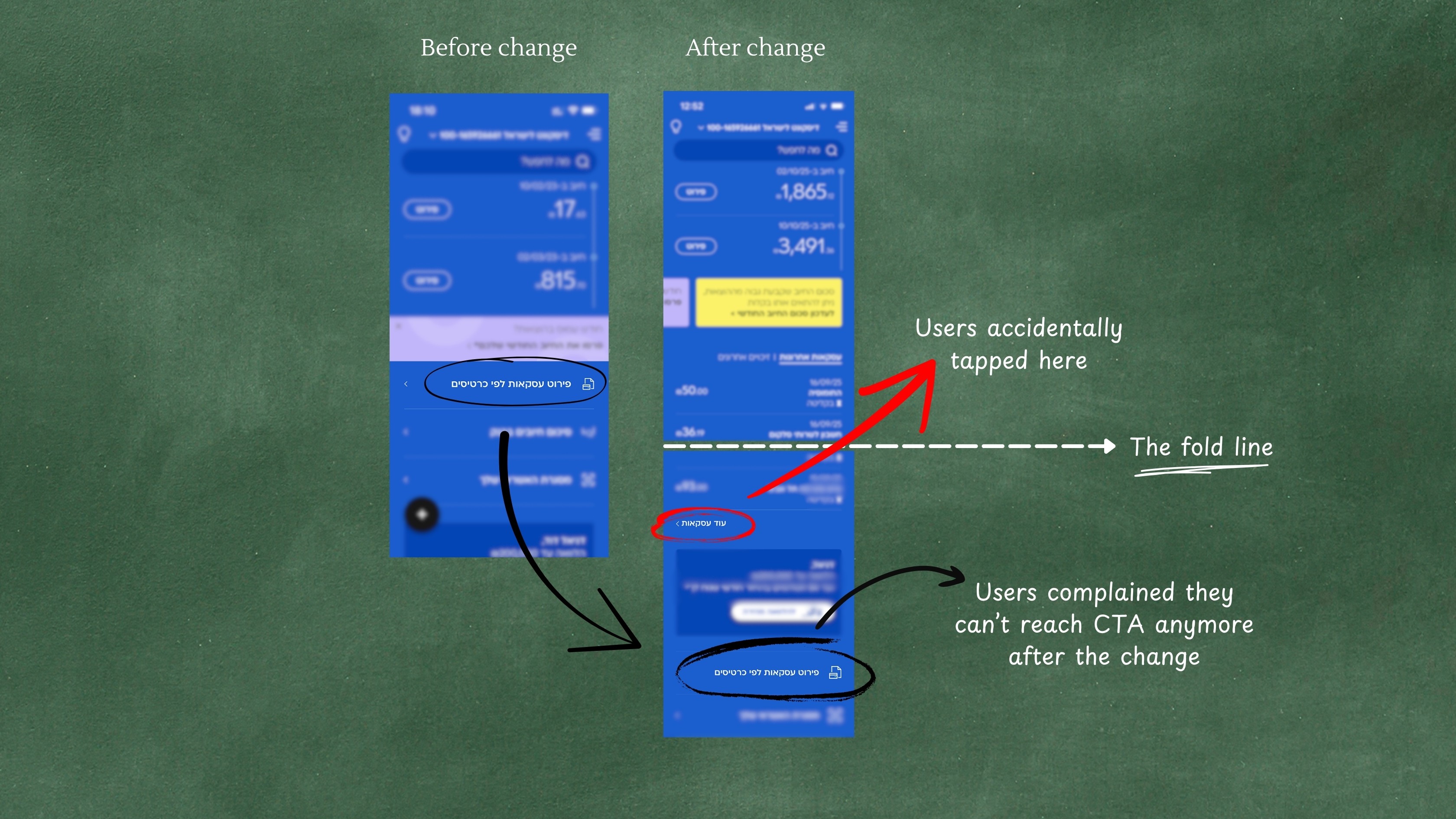
It should be placed after typing a destination


Recommendations
Relocate, rename, improve visual hierarchy
1
Move the button after destination input
2
Rename it for clarity
3
Adjust hierarchy to increase visibility
Reflection
UX design matters - for every feature
This quick study uncovered how a small feature can disproportionately affect usability. Usability testing revealed blockers users never articulated, reinforcing that usability testing is crucial even for features that seem minor - since they can block users in everyday tasks.